4. How did you use media technologies in the construction and research, planning and evaluation stages?
Research: the internet
 |
| Firefox internet browser |
Similarly, we were able to use You Tube to research different music videos. We used You Tube to browse through several music videos which we then analyzed as part of our research into different music videos. You tube was exceptionally useful as it allowed for us to focus on certain areas of the videos. In particular, we chose to look at Eminem-Stan, and chose to Annalise this video, as it involved a variety of camera angles and shots as well as transitions, which were used to tell a story We then used You-tube, to research music videos similar to our own music video, such as The Fray how to save a life. You Tube allowed us to browse through a wide range of videos, and was a great method of research.
Construction: the internet
The internet was a great help when it come to the construction of the main product and ancillary tasks. With the use of the internet, both Emily and I were able to research for help on using Final Cut, which we had never before previously used. This helped us a lot through the construction of the music video, by showing us how to use certain tools such as the split tool, and how to add effects and transitions. This came in a lot of use throughout the construction process, and saved us a lot of time, whilst also teaching both Emily and I a lot of new tools and techniques. We also found tutorials on You Tube extremely useful, when we found it difficult to complete a certain task in Photoshop or Final cut, You Tube offered us a wide range of solutions.
 Once the construction process of the music video was complete, we then used Vimeo , to upload our video, This site offers free video hosting, where we were able to upload our video, and use the HTML coding, to present it onto our blogs.
 Once the construction process of the music video was complete, we then used Vimeo , to upload our video, This site offers free video hosting, where we were able to upload our video, and use the HTML coding, to present it onto our blogs.
  Evaluations: the internet
 The evaluations were presented on blogger, therefore the internet was of key importance during the evaluation period. Blogger was our main way of presenting all of our evaluations to the examiner. We decided to use blogger and the internet to our advantage by using a variety of different methods of answering the evaluation questions and presenting them on blogger. Therefore with this in mind, we chose to use videos and sound recording programs such as sound cloud to record ourselves answering some of the evaluation questions. Similarly, we also used the internet to answer some of our evaluation questions. For example, we used Voki, which was a voice recording anime. This allowed for us to make answering the evaluation questions a little more interesting, by creating an anime which spoke the answer which we had given.
we also used the internet to our advantage when looking for feedback from our friends, by using online social networking sites such as Facebook. This allowed for us to publish our video onto our profiles, for all of our friends to see. Once this was published, we sent messages to our friends asking for their comments and feedback on the video. As this was a social networking site, our friends were able to 'like' and comment their thoughts on the video. This was a great help when trying to receive feedback for our video, as it gave us a chance to gain feedback from a wide range of different people, in a small space of time, without us having to ask questions.
Planning: Bubbl
When planning our music video, we became a little bored of hand writing lists and hand drawing designs. Therefore we decided to use a variety of other forms of expressing our ideas and plans. We chose to use Bubbl: an online brain storming device. This was simple to use and allowed for both Emily and I to express our ideas in a different way, which we both really enjoyed. I found using this device, allowed for our ideas to expand, as we did not lose interest, or become bored, as creating the mind map was really fun and enjoyable.
Planning:Final cut
We also chose to use our Iphone's camera devices to take photos of our planning. For example once we had had drawn our storyboard, of the music video. We then chose to take photos of each scene using our Iphone cameras, and upload each image onto Final cut. Final cut then allowed for us to bring these hand drawns to life. We were able to use this program, to place each scene in sequence, and time the music to the footage. This was a great way of planning as it helped us to realise what would go well with the music and which scenes needed to be changed.
Final cut construction:
Final cut was our method of editing the music video which we had filmed. It was chosen because both Emily and I had previous experience with using this software, meaning that we were able to understand the basics of the program, saving a lot of time. Final cut allowed for us to create a time line, which we could add and remove features, such as video, images and audio. Once all of the footage was put into sequence, we were then able to edit the footage, using the transition effects, as well as the video and audio effects. For example we wanted some parts of the footage to be in "sepia" so that it looked as if it was an old memory. Final cut allowed for us to do this using its effects provided. Final cut also allowed for us to lock some sequences, meaning that they would not change or move until they were unlocked. This became a huge benefit for us, as it meant that we could focus on the editing of one scene at a time, and once that scene was complete we could lock it, so that it did not move or change.
Final cut: evaluation
Finally, final cut was also used during the evaluation period. When answering the feedback question, we decided to film our target audience, by asking them some questions on the music video in order to gain some feedback. Once the filming was complete, I was able to use Final cut, to add text, to show the questions which were asked, and to show the labels of each persons name which participated. This was a great tool, and really brought our evaluation questions to life.
As a part of our planning process, we took part in a lot of research into a variety of products before creating our own. The Iphone camera, helped us in the research process, as it allowed for us to take images of our research. The Iphone camera, was also used during the construction of the products. During filming, we were able to take photos of the scenes, and the character during filming, in order to use these when blogging. This allowed for us to prove what we had been filming throughout that day and show the examiner the mise-en scene of each scene and the props used throughout filming
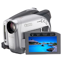
Construction: Cannon Camera
 Emily and I used a Cannon camera for the filming of our music video. This camera was our main piece of equipment which was used through the creation process of the music video. It was very easy to use, and allowed for us to film everything which we needed for the construction process of the music video. Similarly, this video recorder to particular was very good at picking up sound, meaning that the arguing parts of our video were heard well which was another advantage. We also used a tripod which was of great help, when we needed to film with a steady hand, and that was not possible.
Photo shop: construction of the digi pack
 Photoshop was our main program used for the creation of the digi pack. We used the effects, and tools provided by Photo shop in order to create and maintain a house style across the three platforms. For example we used Photo-shop to create a font family, which featured in both the advertisement, and and the digi pack.
  I photo: construction of the digi pack and advertisements
I photo is a digital photo software program which provides the tools and effects needed to manipulate the photos. I photo was very useful when creating the digi pack. By using I photo we were able to use the effects and tools it provided us with to alter the images to create a house style which we were looking for. For example, by using i photo we were able to create the black and white effect which we wanted, to maintain the house style across the three platforms. Although this effect could have been set in Photo shop, using Photo was a quick and easy way to create the effects which we wanted, without having to open up Photo shop, as this program opened automatically when the photos were uploaded. By using I photo it saved both Emily and I a lot of time, in the creation process of the digi pack. However, if we had chosen to use Photo-shop instead, we may have been able to manipulate these photos further, as I photo only provided us with minor tools
to make the changes which we required.


.png)

-01.jpg)


